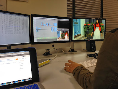
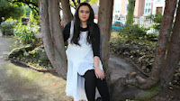
So we have finished the music video after weeks of editing, filming, planning and whatever else goes into the making of a music video. Bring on the ancillary pack and evaluation questions. We decided to follow media traditions and make this small video on Amirul and Abida, ticking off the music completion chart which was obviously fun to do , cant you tell by our excited faces! ^_^
Friday, 29 November 2013
Just Ticking Off.
So we have finished the music video after weeks of editing, filming, planning and whatever else goes into the making of a music video. Bring on the ancillary pack and evaluation questions. We decided to follow media traditions and make this small video on Amirul and Abida, ticking off the music completion chart which was obviously fun to do , cant you tell by our excited faces! ^_^
Skill Development.
This year, I feel my skills regarding both planning and editing have improved quite a bit from from last year. With the planning, I felt I was more prepared about what and where we was filming as we had numerous conversations as a group about what type of shots and the number of base-tracks we planned to film. During these conversation, we also talked about what the costume Yasmin Feruz would be wearing for each location, compared to last year, costume and location planning was a lot better as last year we had a few difficulties in terms of sorting out where we were filming and what the costume would be.
Another thing that differed from last year was the whole production itself and the way the approach to it was taken. For the thriller opening last year, we filmed bit by bit in terms of scenes and locations due to the story boarded structure as with an image and idea of how the final edit would look and how the cuts would be like. However with the music video, we didn't really have a proper structure at first to base the music video around, so this took some more planning and some vital experimenting.
As we were editing the music video, we did start again as we thought the structure could be better which had to be more strict and less confusing which is why we limited the number of locations and base-tracks we used. All in all we had a total of about 35 base-tracks in separate 7 locations, with roughly only 15 base-tracks being used throughout the whole music video. This is one thing I gained from filming this music video, is that you should plan the structure first and keep it simple.
During editing, I did have the chance to experiment with things, for example lights leaks, base-tracking, motion, fades, filters, widescreens, and again like last year, split screens. I do feel that I have become quite a bit of a perfectionist in regards to editing, as the amount of times I went back to change and tweak small things led to me spending the last two weeks of my entire free time editing. However, I am satisfied with the final result but I am wary of whether I will get the grade that I hope to get.
PRODUCTION - SKILLS DEVELOPMENT
This blog is a brief overview of how I approached planning this production differently to my AS production work.
In AS we had to edit the beginning of a thriller opening. Music video's differ from this as there is not many jump cuts in thriller however in music videos there is so many jump cuts used. Also in music video's especially pop music videos there is not a whole lodes of effects, filters and transitions used; there is often a natural camera - we get to see the artist in the normal light not in black and white We also do not dramatise music videos as we would in a thriller. When planning the AS production work we had to make sure we covered a wide range of shots but music videos HAD to have mainly close ups especially if its an individual artist and there are no extras.
The new editing skills I have learnt during the editing of the music video is:
- Cropping more than one shot at a time.
- Changing the colours of the base-tracks.
- Enlarging footage and changing the size.
- Making split screens.
- Putting shots in slow motion.
- Arranging the base tracks.
- Adding light leaks.
Production - Outline of improvements needed for final deadline.
After our rough cut we did get feedback on what was good about the music video and what we could improve on. Below is a list on which our main improvements were..because we did not edit the full song we made sure a few of our clips were perfect so we'd have more strengths than weaknesses.
- Improve lip singing ; make sure lips move with the lyrics - no off lip singing should be noticed.
- Some of the colours were not appealing so we should fix all the colours and make sure the colours for each shot is somewhat alike.
- Make sure all the best shots are good as some are a bit messy and the camera is not still.
- Add a few transitions maybe to start the music video; maybe for when the artist starts singing.
- Because the song is a bit dramatic maybe add an effect of something which exaggerates the emotion.
EDITING - 29/11/2013
Today is the deadline of the music videos. In the morning Amirul went out and filmed two of the locations which we will use and have used for the split screens. He filmed the London Eye and Big Ben. Luckily the two locations were right next to each other so it was a fairly quick process.
As soon as Amirul came back to college we started to crack on with editing. We added in the two location shots after converting them to a movie as he used his own camera to take these shots. It was fairly straight forward adding in the split screens but we wanted to look perfect. It was difficult making the two shots of the artist singing in the exact same spot as there is a match cut used to change the shot.
We also tried adding filters to the split screens as the lighting does not look too great however this was not going on very well so we kept it as it is.
FINAL CHANGE !!!
After we showed Rebecca our final piece she did not like the split screens and suggested that we cut it out as it does not go with the music and it is the only part that has these split scenes. So we had the close ups of the artist singing near Westminister bridge instead.
As soon as Amirul came back to college we started to crack on with editing. We added in the two location shots after converting them to a movie as he used his own camera to take these shots. It was fairly straight forward adding in the split screens but we wanted to look perfect. It was difficult making the two shots of the artist singing in the exact same spot as there is a match cut used to change the shot.
Whilst adding the split screen we had to render the clips quite a lot which was annoying and tiring. We also had to make sure the green line was not there so we had to render that too.
FINAL CHANGE !!!
After we showed Rebecca our final piece she did not like the split screens and suggested that we cut it out as it does not go with the music and it is the only part that has these split scenes. So we had the close ups of the artist singing near Westminister bridge instead.
Rough Cut Audience Feedback
Editing: Light Leaks and Split Screens
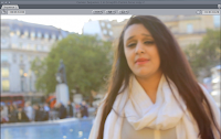
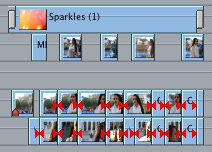 Light leaks are somewhat a transition using light flares caught on a camera. I thought it would be good to use light leaks in our music video I felt it would make it even more vibrant in terms of colours and lighting. We added the light leaks at the start of our music video where the introduction is, as well as in the chorus for the Trafalgar Square locations. Although, I did try to make my light leaks at first, they did not look as good as the ones online so i decided to have a search online for 'free light leaks' and a good handful came up and then I downloaded them and put them in the music video.
 As for split screens, we still had to get some shots of the city so they accompany Yasmin's singing. So today on the 29/11/2013, the deadline, I went out to Westminister to record some footage of the Big Ben and London Eye from various angles. I chose these locations as they are iconic spots of London which should be recognisable to the audience. The city shots of London will resonate with the song itself, 'In My City'.
 Final Change:
Thursday, 28 November 2013
FILMING (reflection overview)
DAY 1 - Tate Modern (TREES)
DAY 2 - Big Ben, Trafalgar Square and London Eye.
DAY 3 - Alleyway
DAY 4 - Small Park opposite City and Islington College
Editing: Fades and Widescreen - 28/11/2013
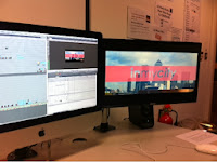
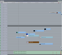 In todays editing session, we were going over the whole video and thinking of what we can improve. Once we spoke about the things we wanted to improve, we started off with the introduction. We decided to add a widescreen effect so the introduction has a more vibrant and nicer feel. We felt that the widescreen made the whole introduction slightly more professional than it was at first.
We also decided to add some fades to the text that we used and the footage itself. We felt they just tied everything together and made the whole feel from the music video a lot better.
EDITING: 28/11/13
 |
| This is the INSTAGRAM shared picture to let people know about what stage we are in the making of the music video. |
These
are shots of todays editing stage. We have decided to work on the
effects and transitions of the beginning of the music video. The text
has been added to show the name of the song and the name of the artist
(Yasmin Feruz). We are expecting to finish in the next few days or as soon as possible the fact is we just want it to be "Just right."
EDITING - 28/11/2013
Today is our last lesson to edit; we can however come in and edit in our own time.
Today we added in widescreen in for the beginning of the music video; this made the music video have a 'professional' look as it is used in other professional music videos too.
Above is how the widescreen looks and below is partly how we did it.
The introduction consists of flowers, the artist walking away from the camera and canary wharf. The flowers start of blurry and then change to focused this is to show that the music video is starting.
We have flares throughout the music video. We also have used a transition fade going on to the first close up of the artist singing.
Wednesday, 27 November 2013
Evaluation Question 1 Ideas.
In what ways does you media products use, develop or challenge forms and conventions of real media products?
This question was also used in the AS Media evaluation question which is why I plan to use the very same idea that I used for last year, in this year. The reason why is because last year I created a 5 minute video, with a voice over going over every small detail regarding thriller openings which can easily in context with music videos. Last year, I used Camtasia to create a video however as I faced so many problems last year with the software, I plan to use something closer to home like Sony Vegas Pro or Final Cut Pro at college. Although, I was happy with my outcome last year, I did get frustrated with the poor interface and lack of consistence of Camtasia. The video to the bottom is the video I created last year, and from what I remember, Rebecca said it was the right thing to do when I asked for some feedback.(pardon the cheesy music)
The things that I hope to include in the video, will obviously be the conventions of a music video that I have learnt over the last few months. I feel that my blogs on Vernallis and Goodwin will be a good source of information that is well detailed, which in essence will help me create the video at a faster rate. I will also analyse my music video and how it follows the conventions of a music video and whether they conform to the ideas from Vernallis and Goodwin whilst I will also go over the influences that have impacted my music video and the ancillary products.
Tuesday, 26 November 2013
EDITING - 25th & 26th
25/11/2013
Today we finished editing the end of the music video; we added our last few jump cuts and put them together. In the end the group decided to end the music video with three locations; this did not look too great as it looked quite messy. We then tried out two locations and that seemed to not look as nice also. We then stuck to one location which is the location which we started with. We used mainly wide shots and close ups. I thought that we should not end with this location because the shots from Trafalgur Square came out nicer where the sun is out and this had great scenery such as the fountains behind the artist.
After finishing up the end of the music video we added in the introduction shot at the beginning of the music video - it was of the artist walking in a park surrounded by trees, grass and a lot of green. I remember that this scene was seen to look like 'Alice and the wonderland' as someone commented because of the beautiful scenery. Below is a screen grab from this shot.
This was also one of the locations which we filmed in but these shots did not come into much use because I felt they were not as appealing and others and also you can see spots on the artists' face and appearance of the artist does play a big part on how big the artist becomes. I had an idea to have a overlap with this shot with the red flowers we used in the alley way scene. Below is a giff of the red flowers and nice green leaves.
The lesson ended and therefore we could not finish the introduction of the music video and will finish it in the next lesson.
26/11/2013
Today I came in and changed the ending of the music video. The reason for this is because I feel that we did not use the best shots and there should be a mixture of two locations - One location which was used in the first verse and the other with the nice scenery with the sun out. I feel that I made the right decision about this because we have some movement in the camera at the end of the music video.
I also asked for Mary's opinion at the end of the music video. I showed her what the group done to the ending consisting of one location and I asked if my idea would be better or not. She told me that no idea will get more marks than the other because they are both good. The ending with one location is good because it matches the beginning as we opened with that location however my idea shows that the artist has been on a journey and therefore they would get the same amount of marks. I used camtasia to take the ending of the two ideas and show the difference.
This is the group's idea with one location used.
This is my idea with a mixture of two locations. I also like my idea because at the end the camera moves upwards. You do see this in a few music video's and I think it gives the music video a strong finish.
Monday, 25 November 2013
Introduction.
After doing all the cuts and main editing for the music video, we left the introduction for the music video till last. I was looking around on what I could use and thought it would be good to introduce the song and artist through text. I thought that it would be good to open up with a red bar overlapping some footage to open the music video such as Yasmin walking on a path and a city skyline. For the walking down a path, I chose to put the artists name, "Yasmin Feruz" and for the city skyline, I decided to put the song name, "In My City". I thought this would be a good way to introduce the artist and song as we can incorporate this into all our other synergy products. This is a small video on how it'd look:
What makes it GOOD ?
- Developing the learning.
By looking at other opinions about what makes a music video I was able to understand what I can do to make sure that the music video can be appealing to our audience. Music videos are constantly changing in style but the concepts are all similar. In general I think all Music videos should be able to tell a story from the beginning to the end.
EDITING: 25/11/13
At this stage of editing there is a few tweaks we have to make to make the music video how we want it. Considering our initial ideas we edit to the way we wanted it to be. So far in my opinion I think that it has gone really well and it looks really good.
Thursday, 21 November 2013
Editing - Cutting, Colouring, Correcting
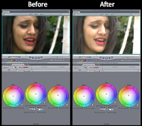 So the last 4 days have been jam packed with editing and constant sitting in front of a mac just so I could meet a deadline for the rough cut that is today (21/11/2013), although we did submit something for the rough cut, it was not finished which I'll explain why soon. So last Friday, the 15th of November was the original day I started making the cuts and edits but on the 18/11/2013, I decided to start all over again so I could do some colour grading for some of the shots which were dark. This did come in handy as once we finish the whole music video we will not to colour correct each clip to make it seem consistent. However, there are some slight difference in colour which we hope to fix soon. This happened to be one reason which stopped us from finishing music video in time for the rough cut deadline. The image above demonstrates the obvious changes and difference from the first shot which is a lot more darker than the second shot which is a lot brighter.
By restarting to edit the music video, we noticed that Abida felt that she looked awkward in the shot where she is sitting down on the tree. We did bicker about whether we should use it or not, and my argument that she looked fine and completely un-awkward was supported by Rebecca. However, we did not use this shot throughout the music video like 2 other locations as we felt if we included them they would disrupt the flow and confuse the audience. The other two locations we didn't use was the one at the Merry-Go-Round and London Eye. These shots also lacked any good aspects like the other shots we have from the locations like Tate Modern and the Alleyway. This essentially have us a better structure for the music video to follow which would be familar with the audience.
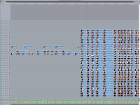 Whilst editing, we decided to edit by adding markers and "razoring" bit by bit as we moved on from verse to verse and chorus to chorus. This turned out to be a good method whilst it did result in me always going back to the section and re-editing the shots as I felt they could have been much more cleaner. I still feel as if there is a lot more improvements that we could make such as making shots longer and reducing the amount of rough cuts that we have as I do sense some shots are really short whilst some are fairly long. This is the main reason which prevented us from completing the whole music video by the rough cut deadline however I do feel that cleaning up the edits now will allow give us more time to fix them before the actual deadline.
EDITING: 21/11/2013
Here is a shot which I thought came out really well with the sun coming in and the fountains at the background. I am really glad that we used these shots for the chorus because they are the best shots we have.
This is a screen shot of what we editing today. We managed to do a verse a chorus and another verse. For the last verse we started we intend to use split screens. We are planning to have half of the screen to show footage and the other half iconic buildings such as the London Eye and so on. We also added in marks for the rest of the song and cut them so it will be easier for us when one of the group members next edit.
This is the chorus.
This is the potential split screens.
We also showed the rough cut of our music video to the class and got feed-back. More information on rough cut post and rough cut feedback post.
Rough Cut
This is our rough cut that we showed it to our class who also happen to be our main target audience, due to the high number of females that are within are targeted age range.. It is not finished as we made late changes to the structure, but it will obviously be done by the final deadline on the 29/10/2013.
Rough Cut Feedback
Tuesday, 19 November 2013
EDITING: 19/11/2013
Today myself and Amirul decided to edit. We finished off colour correcting base-tracks and started to cut them up. We chose which shots we would use in the first part of the music video up to the chorus. We decided to only add in two locations as we did not want to use too many locations at once and two locations seemed like a reasonable number.
We realised that in some of the base-tracks the artist was laughing and this made us change our mind about some of the shots and therefore they had to be replaced. We came across some powerful shots where the artist looks like she is really into the song as is letting out her feelings through her facial expression; this was very helpful and we decided yo use these shots.
Whilst editing we came across a few shots which I thought I looked awkward and uncomfortable however Amirul disagreed. Due to the disagreement we asked for Rebecca's opinion and we found that I thought it looked awkward because I was the performer and therefore I would have a different view to others. We then decided to use this shot.
We realised that in some of the base-tracks the artist was laughing and this made us change our mind about some of the shots and therefore they had to be replaced. We came across some powerful shots where the artist looks like she is really into the song as is letting out her feelings through her facial expression; this was very helpful and we decided yo use these shots.
Pitch Feedback
For pitch feedback I had been told to research on Adele and Gabrille Aplin because they were said to have a similar target audience as us as they also go against Mulvey's theory and do not aim to attract the male gaze.
ADELE
For Adele's part of the research I found that Adele's target audience is women aged from the mid 20s to their mid thirties. Adele is also in her mid 20s as she is 25 years old and this may be the reason why her main audience may be seen to start from the mid 20s. Although that may be seen as the main audience there is a very large age range for Adele as teenagers also listen to her music as well as those who are well over their mid 30s.
Although she is seen as pop singer she also sings R&B and Soul and therefore those who are interested in these three genres are likely to listen to her pop music as well.
Here is a music video of Adele's which shows why her main audience is more likely to me females. The reason is because this song is directed to a male from a females point of view and therefore girls may be able to relate to her.
GABRILLE APLIN
Whilst researching Gabrille Aplin I found that her main audience is 13 to 19 year olds. This age range is very narrow and this may be because this is the core audience. When looking through her music videos it seems that those to their late 20s would also be a fan of her music as they may be able to relate and therefore enjoy her music.
She is a young artist herself (21 years old) and this may therefore appeal the younger groups. She does not only sing pop music but also folk, country and indie music. The different ranges of types of music she specialises in allows her audience range to expand as those who listen to her country music may be interested in her pop music too and so on.
This music video of Gabrille Aplin's shows why females would be her main audience as other females may be able to relate to her.
ADELE
For Adele's part of the research I found that Adele's target audience is women aged from the mid 20s to their mid thirties. Adele is also in her mid 20s as she is 25 years old and this may be the reason why her main audience may be seen to start from the mid 20s. Although that may be seen as the main audience there is a very large age range for Adele as teenagers also listen to her music as well as those who are well over their mid 30s.
Although she is seen as pop singer she also sings R&B and Soul and therefore those who are interested in these three genres are likely to listen to her pop music as well.
Here is a music video of Adele's which shows why her main audience is more likely to me females. The reason is because this song is directed to a male from a females point of view and therefore girls may be able to relate to her.
Whilst researching Gabrille Aplin I found that her main audience is 13 to 19 year olds. This age range is very narrow and this may be because this is the core audience. When looking through her music videos it seems that those to their late 20s would also be a fan of her music as they may be able to relate and therefore enjoy her music.
She is a young artist herself (21 years old) and this may therefore appeal the younger groups. She does not only sing pop music but also folk, country and indie music. The different ranges of types of music she specialises in allows her audience range to expand as those who listen to her country music may be interested in her pop music too and so on.
This music video of Gabrille Aplin's shows why females would be her main audience as other females may be able to relate to her.
Monday, 18 November 2013
EDITING - 18/11/2013
Today we made the colour of the base-tracks look bright as same as each other. Before this we had to un-cut all the base tracks so that the colour for the base-tracks would stay consistent throughout the base basetrack. In some bast-racks we found that the lighting was way too dark and therefore this did not look appealing. In addition to making it look brighter we used one of the filters to make it lighter. We managed to do most of the base-tracks in this lesson; it took time to do because we tried to make each base-track look perfect and not to grey or bright or dark.
We had to move a couple of times because we found that because of the base-tracks the computer was lagging. Overall today's editing went well.
Above is a before and after screen shot of the colour corrector. As you can notice the second shot is more appealing because it is a bit brighter and isn't dull like the first.
RESEARCH/PLANNING: Synergy and Album Promotion
Whilst watching TV at home I came across this advert which reminded me of media. The reason for this is because this advert is for the brand No7 in the shop 'Boots'. Pretty women are in this advert as there is a women singing a pop song in the advert also.
The artist is Jessie J which is also a pop artist and therefore this gave me an idea for future promotions for Yasmin Feruz. For our synergy we have bright coloured lipstick and this could be advertised through young women wearing with one of Yasmin Feruz's soundtracks. Adverts like this one really attract audiences..especially young audiences because of the colour and the song used. The advert is very up-beat which may allow those who see this advert to go and listen to this song further as well as buy the product which is being advertised.
Additionally this advert also shows these women to be happy weather they are young or old. All the women in this advert are smiling and this shows there satisfaction of the product and the song.
The main audience for this advert may be younger audiences but this advert does not fail to leave older audiences out and therefore the older audiences may also feel to purchase one of these items even if the song does not appeal to them.
RESEARCH - What people look for in music videos.
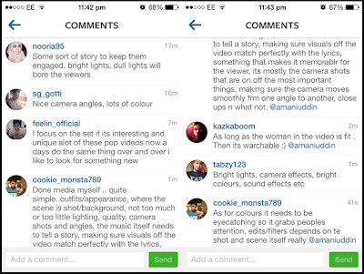
For some additional research I uploaded a note on my personal Instagram asking what people expect in music video's refering to colour, costume, edits and so on. I thought that with the feedback I could get some ideas on what sort of edits would appeal audiences. If people do expect bright colours we could add filters which make the shot brighter and therefore stand out.
I found that people expect:
- Bright, eye-catching colours (Shouldn't be dull).
- Different camera angles.
- Smooth camera movement (Shouldn't move about too much).
- No awkwardness..the artist should look comfortable.
Additionally I recognised that the males who commented on this Instagram post they did expect a pretty girl and this supports Mulvey's theory where it says that music video's attract the male gaze.
Through this research we will make sure we will NOT:
- Include awkward looking footage.
- Shots that are dark.
- Shots where the artist does not look decent.
Thursday, 14 November 2013
Editing: Base-tracks, Markers and Razors! - 14/11/2013
 |
| Marked up song and footage ready to be chopped up. |
This was our 3rd day of editing and we man
aged to complete all the base-tracks and syncing them into the correct place. In total we synced about 35 base-tracks although we did review some footage which we were not happy about however as we have enough to go around, it was not too much of a problem. During this session, we did come across the problem of my cameras footage from yesterdays filming (13/11/2013) being the wrong format however as we did manage to convert all the footage.
 |
| Chopped up song and footage ready to be delete |
Once we finished base-tracking, we moved onto analyzing the song itself and where all the cuts should be. After a long discussion, we did mark up and razor all the places we chose however this was only for the first 30-40 seconds. Firstly, we decided to have the beginning of music video at a slower pace as the song itself is pretty slow, we chose to do this from shots that are equal to the length of the sentence itself. We then decided to pick up the pace as the song did from the short and quick jump cuts. We did this from the distinctive and heavy beats that were constantly repeated but we did stop at the point where there was a continuous beat. This will take some discussion as to how we will approach it through cuts and editing.
Following this, I decided to review the compositions I recorded on my camera and how they would look when accompinied by shots from the music videos. This turned out as a fail as the compositions looks weird and ruined the shots whilst I also was playing around with filters and colour corrections tools which did help create a nicer look for the music video.
Production: Filming Day 4 - 13/11/2013
This happened to be our last day of filming and the reason it was so late is mainly due to the weather and the lack of free time we had as a group. We did face some issues with location as the cafe/restaurant manager did not contact us regarding filming permissions, so we went to the place again and was told to contact HQ instead. However, as we did not have time to do wait for a reply, we decided to go to the local park near college and film there. This scene was essentially for the opening of our music video and planned to have Yasmin sitting down on a bench.
Once we arrived at the park, it had benches but we decided to have Yasmin sit down on the tree which was shaped like a tree. This essentially became a good substitute for the cafe as the mise en scene and background were good. The tree also became a good prop and it is a similar scene to the Tate Modern scene but with no leg movement. Also, we decided to film a little walk from Yasmin under the trees and pass the bushes as it gave off a forest-y feel which made it refreshing to look back on as we reviewed the clips.
In this scene, Yasmin was wearing a cream dress with black trousers similar to the alleyway scene minus the red scarf. However, she did wear her red lip stick as she did in every other location along with some black heels. The filming itself under an hour and we spent most of lunchtime doing so, altogether we managed to film 4 base-tracks including 2 close ups and 2 mid shots from various angles. We avoided doing any wide or long shots as we felt they would capture the people and cars in the background whilst the closes up and mid shots avoided them.
Editing. A quick Keek
Apologies for looking 'dead' and tired as we are all fasting today (religious reasons).
Subscribe to:
Comments (Atom)


