 |
| Advertisement |
Some would say that my advertisement is missing a few things, like ratings from music professionals or social networking sites, which is why I went on a journey, through the search bar on google to the streets of London (not really, just wanted to sound adventurous). After coming across various advertisements which lack both ratings and social networking sites became a great endorsement into the reasoning of why I did what I did for my advertisement. Firstly, let's just analyze my advertisement in terms of its strengths and weaknesses. The main strength I'd say for my advert is probably the whole layout and placement of text. The information regarding the album is centered around the artist's name which happens to be the largest thing following the image of the artist, essentially emphasizing her presence and selling her as the artists. The information itself is all very compact and neat which highlight's the whole simplistic feel of the advert whilst it also generates a stylistic effect due to the white and black colors, also highlight a sense of sophistication and professionalism. Another strength would have to be how much the advertiser links back to the
digipack in terms of the colors, layout and image.
 |
| Digipack front cover |
I purposely used the same image from the
digipack as the background for the advertisement so I wouldn't have to put an image of the
digipack in the advertisement which would have potentially ruined the sophisticated atmosphere of the advert. Also, the placement of the text along with the colors is somewhat identical to my
digipack as the album name "Citylights" is directly placed above the artist name "Yasmin Feruz", along with the same color text. Right, let's go back to my advertisement, and maybe the weaknesses? A weakness in my advert could potentially be the lack of ratings that increase credibility, or social networking that increase fan interaction between the artist. The reason I didn't want to add these things is mainly because they could ruin the whole compact layout and simplistic feel of the advert due to the disruption in continuity and flow, which is something I value and mention a few times in previous blog posts.
 |
| Jessie J Advertisement |
So here's some examples that disregard both, the first advertisement I came across that lacked both of these aspects was from "Jessie J" and her album "Who You Are". The advert is weirdly similar to mine in the sense of colors and simplicity. The use of black and white highlights the simplistic approach yet the use of gold has begun to take over to become a more stylistic advert. The advert itself is missing both social networking sites and ratings, which does give me some fuel to reason my own reasoning of not including them, if she can do it, why can't I? Here's why, Jessie J happens to one of the biggest pop stars on the planet, so I doubt she will need the opinion of someone who sits in their office writing reviews all day on people they've never met. Nevertheless the rating does help improve the credibility and draw attention to new artist's but for someone like Jesse J who has accumulated a huge following online and offline, wouldn't need the extra exposure I guess. Also the absence of the social networking sites is replaced with the artist's website which could be a better place for fan interaction as well as providing more information regarding the artist, something which I have done, replacing social networking sites with a website.
 |
| Gabrielle Aplin Advertisement |
 |
| Gabrielle Aplin's Album Cover |
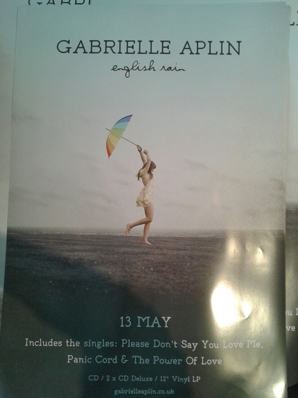
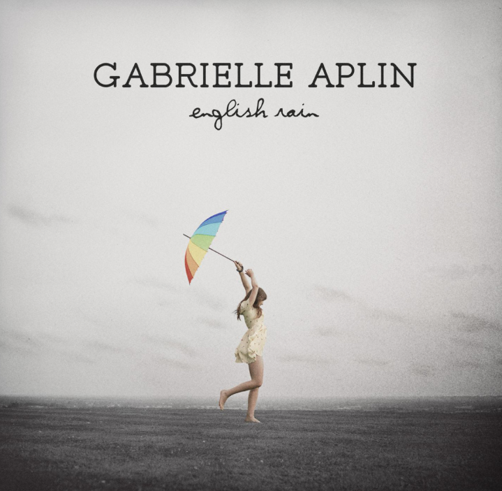
You're probably asking yourself, "Yasmin Feruz is a new artist, therefore it would be best to have ratings", however, whilst researching I came across another advert, from a brand new artist who doesn't use ratings, or social networking sites on their advert. This happens to be "Gabrielle Aplin" and her album "English Rain", which is also a main inspiration for Yasmin Feruz. Again, this advert very similar to mine, almost identical is some ways, such as the image used, the synergy with the
digipack, the placement of the text and the lack of ratings and social networking sites. The advert itself doesn't show an image of the
digipack but as most of the elements of the advert such as the album and artist name, the image and the text are all similar to the
digipack which is why it is not needed, just like I have said about my advert. Although, this album from "Gabrielle Aplin" is her first album, she lacks any ratings and the same question popped up, "Why can't I?". If this artist can disregard ratings, my artist can as well and the main reason being is probably, if the advert is well executed and has the professional look, it will resonate with the credibility of the artist which is why I feel that is enough reason to not include ratings.
Does that make me justified? Hopefully my reasoning are justified and do not backfire as they do contain some relevance as to why I didn't include ratings or any social networking sites in my advert.


Ami - your advert is most certainly complete and looks super. I'm really sorry but I can't view your other work from where I am so I'll leave comment about the rest at work in the morning! m
ReplyDelete