Showing posts with label Amirul Islam. Show all posts
Showing posts with label Amirul Islam. Show all posts
Friday, 24 January 2014

Final Progress Review Blog
This is my final progress review blog, and unlike last year I am a lot more consistent of these types of blogs where I look back evaluate my growth in terms of blogging. Last year, blogging was fairly new to me, where I lacked writing skills, presentation skills and skills in general but over the year I picked up some valuable skills which I keenly applied to this year, whilst learning a bunch of new things. Compared to last year, I'd happily say that I have become a more refined and knowledgeable media student who knows how to write, how to present, and what makes a media product right and wrong. This year I have been able to meddle in editing vlogs, interviews and music videos essentially making the whole process a lot more fun, only when the videos don't mess up and corrupt, like it did many times this year and last. I began to use a lot more types of ICT which undoubtedly helped with the presentation and interaction my blogs offered. I do feel my blog contain quite a lot of information regarding every stage that had to be taken when making our media products and after, where I don't really lack any gaps and such. I feel that my individual post are up to a good standard as are most if not all my blogs, in which I have included extra blogs such as behind the scenes, concert analysis and being a runner on a music video which was the most exciting this that happened to me this whole in terms of media things.
Evaluation Question 1:
“In what ways does your media product use, develop or challenge forms and conventions of real media products?
This is a short video of examples from my own music video based on the theories and the influences that I have mentioned from the above newsletter.
Evaluation Question 2:
How effective is the combination of your main product and your ancillary texts?
 When talking about a combination, it would refer to the term synergy which is the certain aspects of one product that relates to another product, and in our case we refer to how the music video relates, and links to our ancillary products, the digipak and advertisement. When planning the synergy of all our products, we had a clear idea of what kind of aspects we would try keep consistent throughout the creation of all our media products, and these were the;
- Colours - Colour scheme throughout all media products
- Costume - Makeup, Clothing, Accessories
- Mise en scene - Locations
- Identity - Artist Image
- Text - Font, Font colour

Red Lipstick
throughout
music video
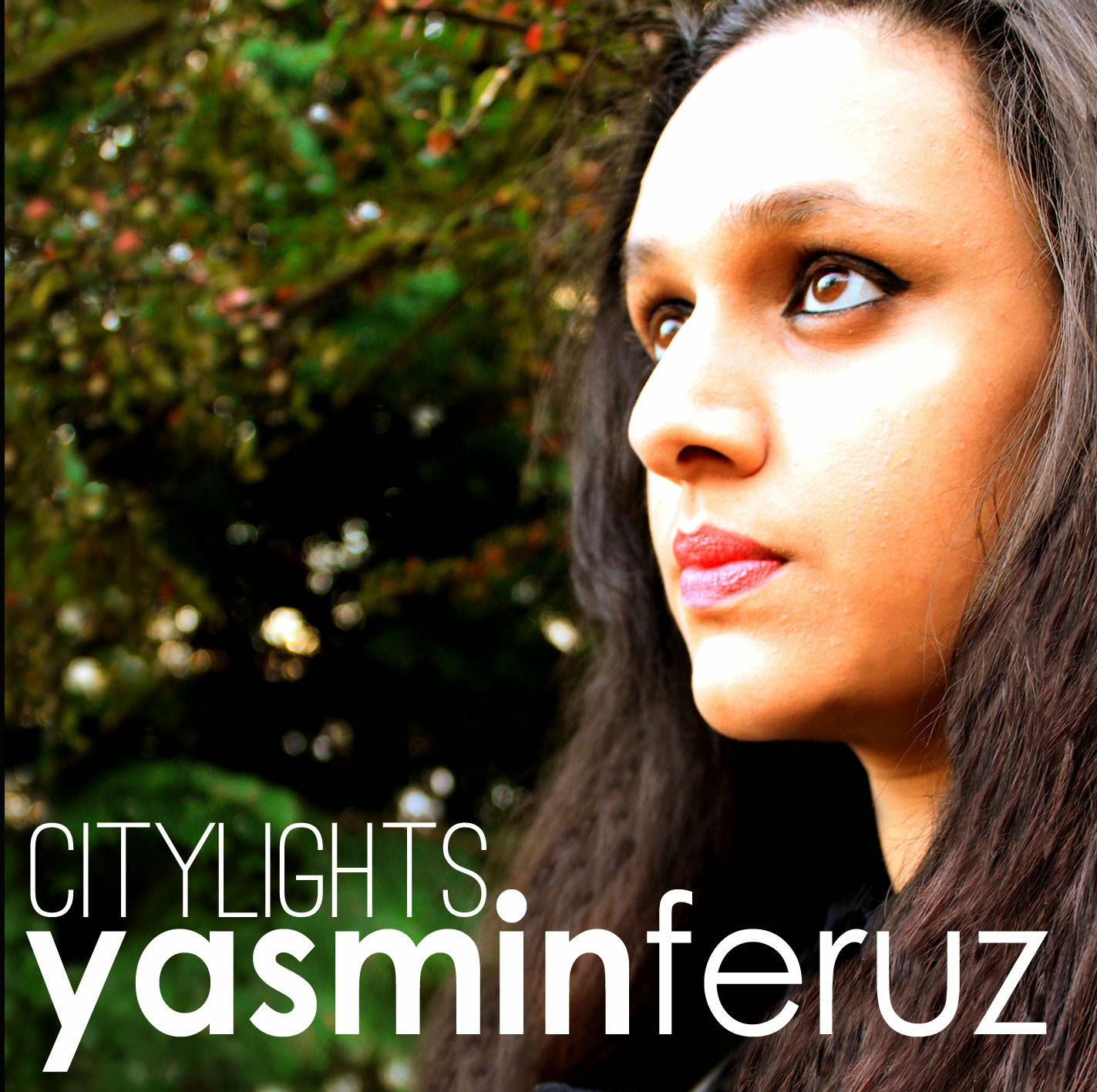
Starting off with the colours present in our music video, we came up with a set of colours that we wanted to be as a recurring aspect within the video itself, and somehow bring all or most into our ancillary products. Most of these colours essentially interlink with all the other synergy aspects that we combined into our media products. The colour scheme that was mainly present within our music video was white, black, green and red, and these were either found in the locations we used or the costumes the artist wore. The first mix of colours that was seen in the music video was during the introduction, where there is a green bush with red flowers, a location that was constantly on repeat throughout the music video. The whole introduction also had a red bar across the footage. As the location had a good mix of colours, this was incorporated through the colours found within the costume. The artist wore a red scarf that is similar to the red flowers along with a white dress and black leggings and throughout the whole music video, she constantly wore red lipstick.
 |
| Music Video - Red, Green, White and Black Colours |
 |
| Location used in both ancillary images and music video intro |
 |
| Ancillary: Green, White, Black and Red Colours |
 |
| Digipak (Front Cover) |
 |
| Black clothing in white tree location with green background |
 |
| Advert |
 |
| Accessories and Jewellery used in music video |
 The last thing that combines all my media products has to be surrounded around the type of text I used. During the introduction of the music video, the artist is introduced as "Yasmin Feruz", the font used in the music video was "Century Gothic", which was simple and sophisticated like the image we were trying to create for our artist. I thought it was pretty important to keep the font for our artist's name the same between all the media product make the link in terms of synergy far more stronger than having different texts. For all my ancillary products the places where the name of the artist was present, I maintained the "Century Gothic" font, whilst the rest of the text was in "Ostrich".


 One existing product that is fairly similar to mine in the way it uses synergy with all its other products is from Jessie J, and the links to her music video "Wild" with her ancillary products, the advertisement and digipak. The video itself is made up of a lot of white and black, which emphasizes the simplistic aspect of the video, something also apparent in my music video.
The white and black from the video is also seen in both her digipak and advertisement, which strengthens the link and the ability of the audience to identify the synergy. The white background of the digipak and the advertisement resonates with the prime location in the music video, where Jessie J does her singing and dance routine. This goes to show that a recurring colour scheme is useful as it makes the synergy a whole lot stronger, and helps construct strong visual links. Jessie J's bald head is her image and identity and is constantly reiterated through the repetition of the same portrait in the ancillary products. The video also features Jessie J drawing attention to her new image as she is constantly touching and showcasing her bald head in her performance.
When looking at all my media products, I do feel there is a good sense of synergy between all products due to the way the colour scheme bonds with the use of text, essentially creating some strong visual links. When creating the music video, we had to keep in mind all the stuff that we wanted to use as synergy, by carefully focusing on what we were filming, we began to construct a better idea of what we could include in our ancillary products. By doing this, our audience may find it easier to identify the many links that we have included throughout all our ancillary products.
Evaluation Question 3:
How did you use media technologies in the construction, research and planning and evaluation stages?
LE ANIMATIC!
Evaluation Question 4:
What have you learned from your audience feedback?
This is the audience responding to the music video and ancillary products!
]
A2 Media Studies: Audience Feedback to Music Video and Ancillary Products from Amirul Islam on Vimeo.
This is my response to the audiences response to the music video and ancillary products!
This is my response to the audiences response to the music video and ancillary products!
Monday, 13 January 2014


Sunday, 12 January 2014
Ancillary: The Advertisement Explained!
 |
| Advertisement |
|
| Digipack front cover |
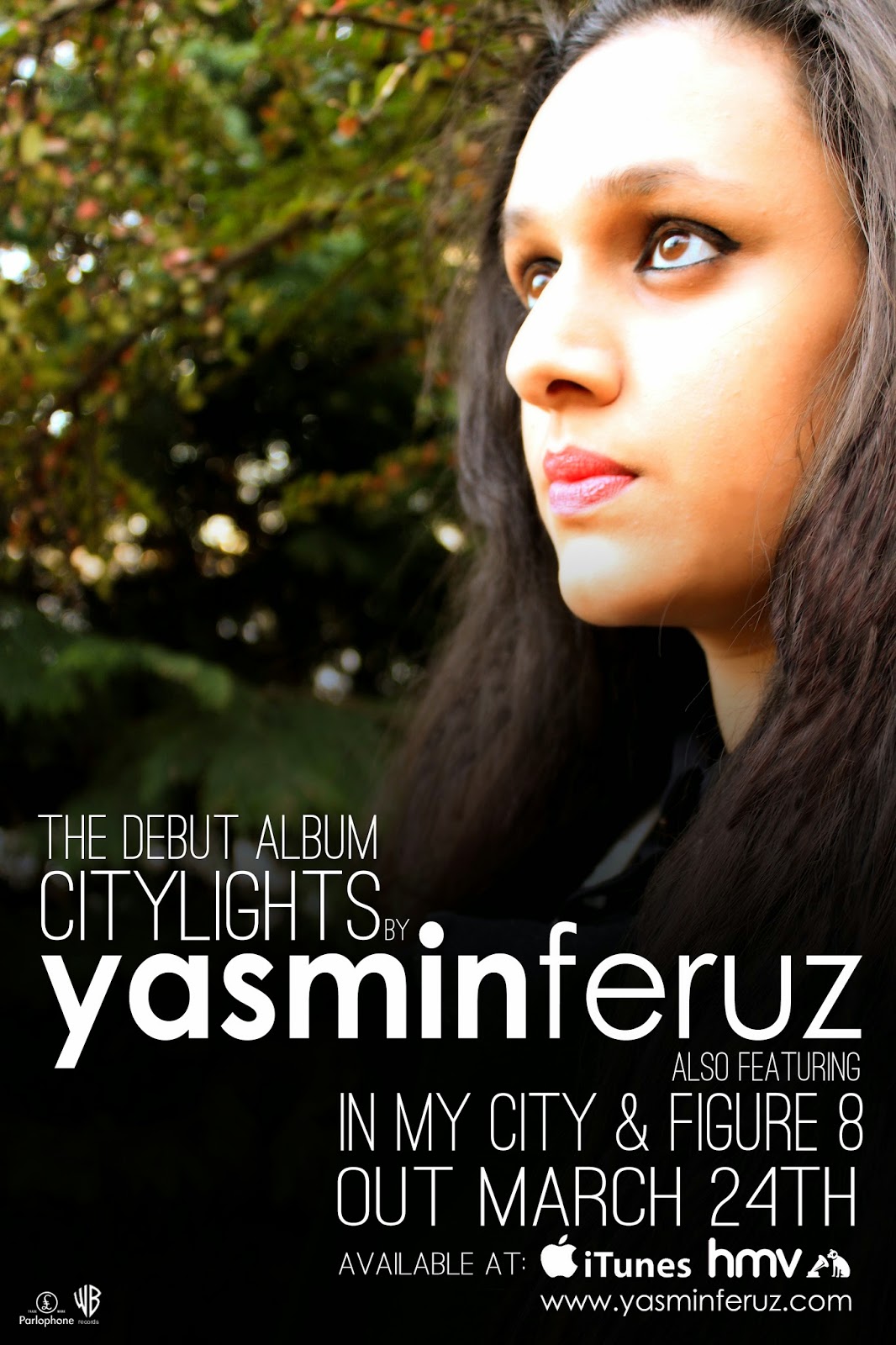
I purposely used the same image from the digipack as the background for the advertisement so I wouldn't have to put an image of the digipack in the advertisement which would have potentially ruined the sophisticated atmosphere of the advert. Also, the placement of the text along with the colors is somewhat identical to my digipack as the album name "Citylights" is directly placed above the artist name "Yasmin Feruz", along with the same color text. Right, let's go back to my advertisement, and maybe the weaknesses? A weakness in my advert could potentially be the lack of ratings that increase credibility, or social networking that increase fan interaction between the artist. The reason I didn't want to add these things is mainly because they could ruin the whole compact layout and simplistic feel of the advert due to the disruption in continuity and flow, which is something I value and mention a few times in previous blog posts.
 |
| Jessie J Advertisement |
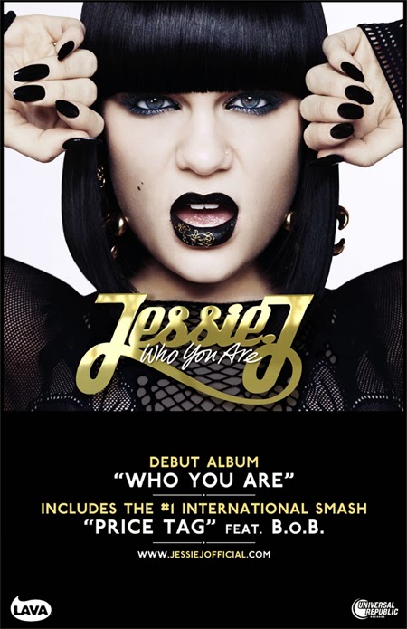
So here's some examples that disregard both, the first advertisement I came across that lacked both of these aspects was from "Jessie J" and her album "Who You Are". The advert is weirdly similar to mine in the sense of colors and simplicity. The use of black and white highlights the simplistic approach yet the use of gold has begun to take over to become a more stylistic advert. The advert itself is missing both social networking sites and ratings, which does give me some fuel to reason my own reasoning of not including them, if she can do it, why can't I? Here's why, Jessie J happens to one of the biggest pop stars on the planet, so I doubt she will need the opinion of someone who sits in their office writing reviews all day on people they've never met. Nevertheless the rating does help improve the credibility and draw attention to new artist's but for someone like Jesse J who has accumulated a huge following online and offline, wouldn't need the extra exposure I guess. Also the absence of the social networking sites is replaced with the artist's website which could be a better place for fan interaction as well as providing more information regarding the artist, something which I have done, replacing social networking sites with a website.
 |
| Gabrielle Aplin Advertisement |
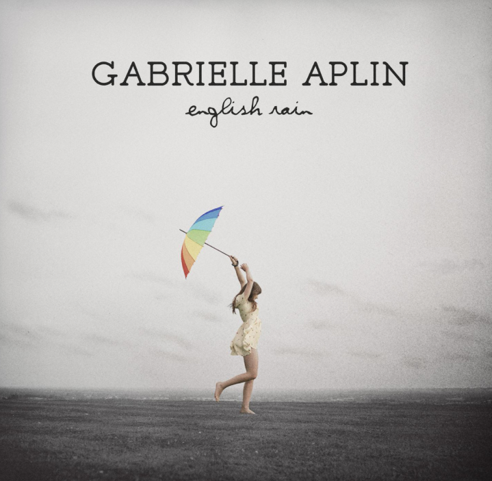 |
| Gabrielle Aplin's Album Cover |
Does that make me justified? Hopefully my reasoning are justified and do not backfire as they do contain some relevance as to why I didn't include ratings or any social networking sites in my advert.
Friday, 10 January 2014
Ancillary: Le Advertisement Process...
 |
| First Attempt |
 Creating an advertisement was extremely challenging mainly because I didn't know how to to apparoah it but as I created my digipack first, it begun to set the foundations to my advert in terms of colours, text and images. As I opened up a new document for my advert, I wasn't sure whether to do go with a landscape or portrait layout, although my mock-up had a portrait layout, I thought it would be best to go for a landscape layout in which turned out to be the worst choice I made, and instantly went back to my initial idea from my mock up. This happened several times (3 times to be precise), that I went back and forth between both landscape and portrait layouts. The first attempt at the advertisement was in my eyes, horrendous, although I didn't get far enough, the advert didn't really feel unique when in comparison to all the student advertisements I have seen. Probably from the landscape layout is what made is look so "generic" and probably the black box which fades in (WHOOPDEDOO).
  |
| Citylights fits right above Yasmin Feruz |
 |
| Second Attempt |
I started again, but still kept the landscape layout but did play around with the colours and the wording of the advert. I felt this advert has a more unique feel to it, maybe because it differed a lot from the digipack itself as I used black font instead of white but had a white background to maintain the colors scheme, I only changed the font colour. I also added a black bar along the side of the advert because I thought it added a stylistic element to the whole digipack, which did look pretty good to me. The whole wording of the advert did take a bit of testing as I couldn't find something that felt right and looked good. With this advert, I didn't really sense a sense of synergy with the digipack mainly because of the colour of the text, but also the layout I used. It felt to centered whilst the white background didn't flow into the image where the front cover of my digipack felt like everything fitted together in terms of the colour scheme, the image and text in which I had to incorporate into the advert. So I started again but this time taking everything I wrote into the next attempt because I was too lazy to rewrite the whole thing.

 This was my final attempt, where I kind of followed my mock up cause I decided to move on to a portrait layout, which turned out the work a lot better than the landscape layout. As I was making this advert, I continued to experiment with colours, the text, and the background. I went back to the white text and black background from the first attempt as the overall flow felt a lot more better. With this advert, I tried making the placement of the text a lot more unique so I began to make all the information such as the release date, website and everything else a lot more central to the artists name to draw more attention to her as the whole point of the advert is primarily to sell the artist and secondly the album. I maintained the white throughout as I did in my digipack, whilst it didn't feel right to throw in another colour that could potentially ruin the simplicity of both products. The gradient which I used worked exceptionally good as the image blended well in the the black gradient due to the dark colours of the image.
 Thursday, 9 January 2014
Ancillary: Digipack & Advertisement Draft.
These are the close to final outcomes of my digipack and advertisement, however there are some things that I need to include and possibly change, for example the inside cover, which I want to tone down a bit as the leaves may be a tad over the top. Overall, I am happy with how my advertisment and the front cover of my digipack turned out.
Ancillary: Past Student Ancillary Analysis
I behold the most aggravating, annoying, frustrating software ever created. Enjoy.
Ancillary: Text and Colours


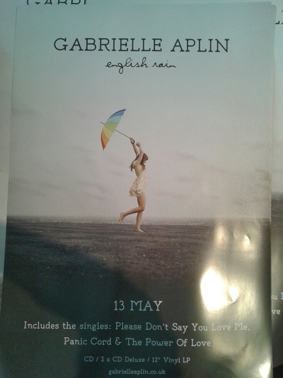
When I first started my digipack, I wasn't sure whether to use one font to have a sense of simplicity or have two fonts for some variation within the whole digipack. After my initial research and going back to my inspirations, I looked at the variation in texts that the digipacks used, and the one that stood out to me the most was from Gabrielle Aplin, who uses two fonts that work really well together. The artists name really stands out from the whole front cover as it is clearly the most dominant aspect as opposed to the album name which is clearly smaller yet holds it's own significance due to the difference in font. The calligraphic type of text really captures the femininity of the artists, and it the same colour of the artist name which highlights their link to each other. The font type was carried in the back cover of the digipack where the colours of the text was also the same. Another thing that I really admired about the digipack is the placement of the text itself, especially for the back cover where everything from the track-list to the barcode was centred. The use of colours in this digipack is exceptionally well in my eyes as it contain a sense of simplicity and doesn't overdo it, the use of black font for the track lists and the white for the labels, barcode and copyright information set them apart from each other, which goes to show that the smaller things in life have a bigger impact.
 |
| The Outcome |
 |
| Century Gothic, Ostrich and Popsies |
Once I had a look at the digipack above, I wanted to take a lot of aspects into my own digipack as I thought the taste and simplicity of the digipack was well executed and is something that I wanted to do myself. When I first started, my digipack only had one type of font that was used consistently throughout the whole digipack, but after researching I though it would be best to have another font so there is some variation, and more versatility for me to experiment. I kept the artists name in lowercase and the largest thing on the front cover as I thought it would make it unique and more noticeable to the other things on the cover. The font I used at first was "Century Gothic", and at the time it looked good but went on to look bland and repetitive so I chose another font which is similar to Gabrielle Aplins and thought it worked well, and the font was "Popsies". However, I also saw another font that caught my eye, and this font was "Ostrich" which worked really well with the artist names which is uniquely "Century Gothic". This essentially became a problem as I wasn't sure whether to use "Popsies" or "Ostrich", so I decided to ask which one people preferred and most said they preferred the "Ostrich" font.
 |
| Back-cover w/ centred text and info. |
Once I worked out the fonts I wanted to use, the "Century Gothic" for the artist name and "Ostrich" for the album name, I thought it would be best to have the colours of the text the same throughout and I decided to go for white as I thought it would stand it stand out from the background its placed on. The colour white was also taken into the information that is found at the bottom of the back cover and essentially became a sort of motif that is apparent in all my ancillary products. Just like Gabrielle Aplin, I took the idea of having everything of the back cover centred and it worked just as well as I thought it would. By doing this and maintaining the colour white, the whole digipack had a good sense of continuity and flow. For the spine of the digipack, I made the background black so I could still use the white text, and it worked well as it set a distinction between both the front and back cover, yet it still maintained the flow through the continuous white text.
 |
| Layout for the advert text |
After I finished the front and back cover of my digipack, I moved onto my advertisement, which has similar aspects to the text and colours of my digipack. The advert itself has a similar colours scheme of the black and white, with the black coming from the gradient in which is placed at the bottom of the advert and the text is white, placed above the black gradient. I used the same combination of font which is the "Century Gothic" and "Ostrich", adding some synergy to the digipack and advert. Like my digipack, I kept the artists name in "Century Gothic" with everything else in "Ostrich". After doing some initial research, I wasn't sure how to approach the layout, but once I tried various ideas, I decided to make everything a lot more compact and centred around the the artist name, so there is more significance on selling the artist. I think this advert was the best one out of all the adverts I attempted at making, with most being discarded or me just giving up, but let's save that for another blog.
Thursday, 19 December 2013
Ancillary: Digipack Update.


 This is the back cover of my digi-pack, where I have placed the track list, the bar code and the record labels for my artist. I decided to stick with the same colour font which is the same as the front colour of the front cover of the digi-pack. I mainly stuck with the white font from the front cover, as I felt it helped with the flow of the digi-pack and added a touch of simplicity also the font is the same which is "Century Gothic" from the front cover. I began to really over think the smallest things for the whole digi-pack as I thought mainly about the layout of the track list which is all centered aligned with the bar code, record label and websites. I think the simplicity of the whole digi-pack makes it look exceptionally good and professional if I say so myself. The reason I did the pattern in bold and regular font is mainly because that is what the front cover is like as half the line is in bold with the rest in regular font. I think it was important to take this concept over to the back cover for the whole flow of the digi-pack as well as that it looks rather odd without it all just being bold or regular. The image for the back cover is actually from a different image from the photoshoot, I felt it was pretty important for the images to have the continuity that the fonts had just because I am the perfectionist I have been labelled as. It took a bit of time to merge both images to make it look like one whole image, but with some blending, a layer mask, some gradients and the clone tool I was able to make it look like a whole image. I tried this technique with multiple images but only one sufficed, which happened to be a similar shot of the artist with similar compositions, but the artist was looking directly at the camera. As the background was more or less the same with slight difference, it made it even more believable to merge.
 Wednesday, 18 December 2013
Ancillary: Photoshopping Images

The image to the side is the image that I have decided to use for the front cover of my digi-pack as I thought it was one of the bests out of the bunch I had. Mainly inspired by Gabrielle Aplin, I feel this image is quite exceptional in terms of colours, compositions and lighting. The background of the image is out of focus, putting more attention on the artist who clearly has the lightest value which contrasts her from the darker background. The original image was quite dull and lacked anything interesting, so I decided do some color correction using the levels tool which made the dark colors darker and the light colors lighter, improving the overall tone of the image. I then moved on to fixing the skin tone of the artist as I felt the white colour was pretty dominant on the face of the artist, I ended up with a more brown and vintage look which was unplanned but looked way better than without it. I finally went on to fix the artist's using the clone tool, I feel by using this I was able to make the hair look a lot more full and less frizzy in some places. I feel this image links to the music video quite a bit as the green from the background, the black from the costume and red from the lips were all present in the music video.

This is what I have achieved so far, and this happens to the the first panels, the front cover of the digipack. I feel it is pretty good so far, but there are some things I could improve. I think I might have to play with the color of the image a bit more whilst I could improve the framing slightly. I decided to use the "Century Gothic" font as it is the same font that was used for the intro of the music video. This would be good for the whole synergy part for our new artist. I followed the conventions of digi-packs as the artist's name is bigger than the album name, however I feel the font should be different to each thing which is something I will look into as I go more into making the digi-pack.
Audience Feedback.
This is all the audience feedback that I collected following the cinema screening, I managed to get quite a handful of responses regarding the things the audience liked about the video. However, I failed to ask any questions that would be of proper use to the evaluation questions, such as improvements needed, question that would be linked to the audience and genre.
Friday, 13 December 2013
Thursday, 12 December 2013

Subscribe to:
Posts (Atom)