Showing posts with label Emadul Rahman. Show all posts

Thursday, 23 January 2014

EVALUATION: Question (4)

Some positive feedback from the Showing of the Music video at the cinema. 


There were constant feedback through out the year. 
- Pitch to class and teacher 
- Footage (base tracks) recorded
- Rough Cut & Anamatic Storyboard 
- Cinema review 
- Ancillary Work after finishing advertisement and album panels. 


(Video unable to upload)
These are the feedback that actually made a good impact in the work that we did throughout the media project.

The feedback from the teachers and students in the ancillary stage of our work were really useful. The feedback highlighted that some of the conventions of a CD cover were not met like the color and use of font. This was edited by thinking and researching font types and understanding which one will give a better impact for the CD cover and other feedback were generally for the music video. But overall without the feedback we wouldn't have created such a great quality music video as we did.


I couldn't get the video up but this was the speech that was said in the video (VLOG)
-   "By getting feedback for all stages of our work process I believe that it has enhanced my work to a better standard and can also help to get those little bugs in my own work fixed like the simple spelling mistake can be found when you are given feedback. This is why when reflecting and then improving can benefit your work and your standard of what you have done."


EVALUATION: Question (3)

How did you use media technologies in the construction and research, planning and evaluation stages?


This is the Anamatic storyboard.


EVALUATION: Question (2)


How effective is the combination of your main product (video) and ancillary texts (digipak and advertisement)?

The link between the music video and promotional package are the lighting and the scenary yet I didn't want to make the album only focused on one of the songs listed on the album back cover. So the aim was to make the album cover reflect some of the song title choices. The music video has a lot of greenery and natural settings in the background making the artist stand out more. 

The Locations:
Outside the Tate Modern, The merry-go-round near then London Eye as a winter event which was accompanied by winter shops selling Christmas based gifts. Also locations were at Trafalgar Square and an Alleyway near College: nearest to Angel Station. These clips filmed helped us to understand what kind of image we are trying to create for our artist and then the captured footage can be manipulated and adapted to create an amazing ancillary digipak for our artist. So we done a photoshoot and all decided that we love the images from the little park outside college due to the greenery and the sense of miss en scene. This created the synergy of nature throughout are ancillary work and music video. Also editing the music video with colour correction we emphasised the bright green natural colours in the shots.
This is a screen shot from the video showing that the image used is from the park which is  a unique clip and is not a base track. But this just highlights to the audience what kind of settings that the audience should expect.
The beginning of the music video links heavily with the ancillary due to the fact that the images for the album and poster are from this location and the way in which the rest of the video links is the scenes from the white trees outside the Tate modern. The idea of nature is used throughout the music video to emphasise the calm and natural personality of the artist. The gif shows some of the scenes that actually show the greenery and the natural settings in the clips even if the location is not in a natural setting like the clips from the alley way which also did have some greenery.


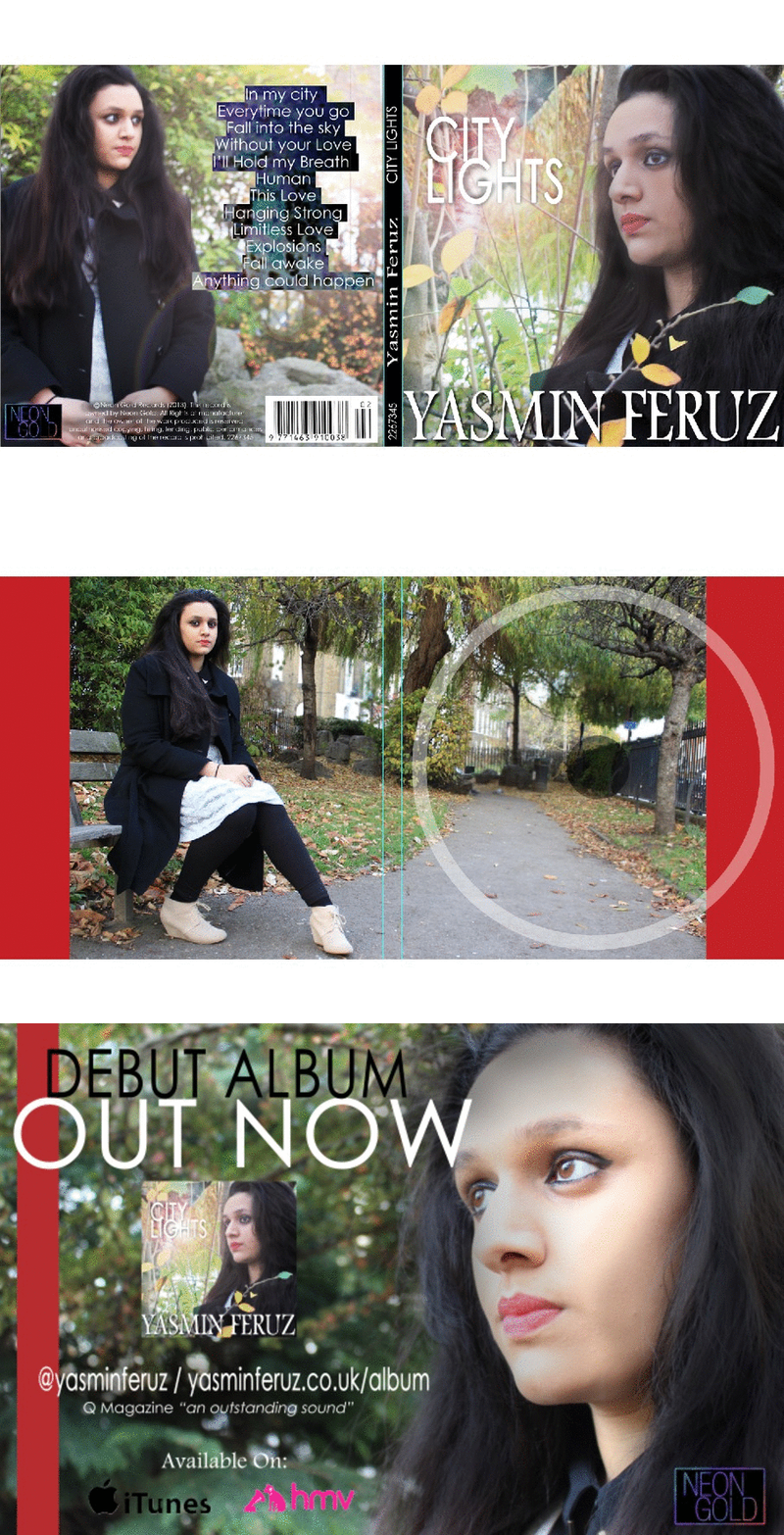
HERE IS MY ANCILLARY: Album & Advertisement.
By looking at the ancillary you can see that the colour scheme of the costume is something that we also had to keep a constant. White and Black dresses. We decided as a group that the main costume and the look should be dresses to represent an easy flow and make the artist look comfortable in the clips. The clip in Trafalgar square is different due to the fact its more of a blouse yet it has the same features of a free flow of movement abled by the artist and makes her look comfortable with what she is wearing that adds to the performance. 
The scarf was the first initial synergy that we wanted to use throughout but then thought since the colours change in the video then we might as well change the synergy thing that brands our artist. This is now the red lipstick. used in the ancillary and the music video in all clips and images. 

My Ancillary (Focus)
In my own opinion I believe that the text works well with the album. I have decided to choose two different texts to use in the ancillary. Which are: Century Gothic and Footlight MT Light.
This brings us to the audience. I believe that the way in which the album looks really simple with the image being the main focus can attract the audience that like bright images that spark the mood of being happy and feel joy. Psychological studies say that either blue or green make a person feel joy and feel calm. which is the sort of music included with in the album.  So the actual album cover can set out a feel/mood to what kind of music the audience/target market should expect.

Thursday, 16 January 2014

(Planning) Question 1


QUESTION 3 (overview) 
I decided to make a prezi. that shows all the technologies used and also I'm looking to make a diagram of equipment and then label them to show what makes them so useful and how it was used.

I took some notes for Question 1 and 3. This was done by going back through the blog and finding the key blogs that will help me do the questions. I specifically looked at the theories by Andrew Goodwin and Carol Verallis.

EVALUATION: Question (1)


In what ways does your media product use, develop or challenge forms and conventions of real media products?


Influence / Inspiration

The main influence that I think contributed to the music video is the music video from the Saturadays and the music video from Gabrielle Aplin - Panic Cord.

The Saturdays - Disco Love
The reason why I could relate the Saturdays music video to the making of our music video is that I specifically liked the lighting in the music video and also I saw the potential of our music video creating the same sort of atmosphere as represented in the performance of the artists in the Disco Love music video and tried to copy the sort of performance used in their music video by telling our artist this it made the music video more 'powerful' in a way that the audience would see that the artist is into the song as much as she wants her target audience to be.


Gabrielle Aplin - Panic Cord
From this music video we used the same type of lighting due to the fact that the lighting is a little similar in the music video from the Saturdays but that one is more warmer where as the music video for Panic Cord is more of natural light so it varies in our shots. Some of the summer feel is shown in the scenes/clips from the shots in Trafalgar Square and then the other ones like the one outside the Tate Modern with the white trees are natural light. Also the shots for our music video's were almost identical to some of the camera shots in the music video of Panic Cord which are shown in the diagram below.


Left side is all from the music video from Gabrielle Aplin (3images) and the Right side is from our music video by Yasmin Feruz (3images)

Another music video that inspired us to create our own music video like we did was from a music video from the past student. (Group25) uploaded a year ago. 


25. Christabell Ndive, Juliana Lopez, Tamara Akotuah


Forms & Conventions in Ancillary

When doing the ancillary I stuck to the rules and made the album cover front/back the way most albums are created. However most album covers have things inside (the inside panels) where as I just used an image from the photo-shoot and thought that this could just speak for itself and make the inside panels look appealing and without adding more text it allowed me to add in the red strips that indicate/represent the colour of the artists lipstick and scarf (red) which was a synergy that we used throughout. More the lipstick than the scarf.
Inside panel of my album.
Genre
The way in which genre was addressed was the way we captured the lights and the way there was sun glares/lens in some of the music videos we looked at. The pop and indie genre was mixed up in the music that we chose: In my city - Ellie Goulding. The way in which we went about the lighting in the music video is not to worry about it when filming and then enhancing it in the editing process by changing the colours hues with colour correction. Also in my album design I used an artificial effect of a sunlight flare using the front cover and back cover to add the bright effect almost magical. The pop genre is all about repetition and making it recognisable for the audience so its sort of popular depending on what kind of person you are when it comes to music. 


FINAL ANCILLARY WORK


UPDATE 16/01/14

POLISHING THE FINAL DESIGN.

For now I will ask around and present my finished Ancillary Work and see if it is appealing for the target audience. The target for pop/indie music is hard to determine. It can easily grow on someone over the years or can be drilled into them by their surroundings. This is what it has been said in various reviews and articles from psychologists and general magazine writers.

By looking at this and doing the survey it allows me to think about the evaluation questions that I will be doing soon enough. The fist question looks at the conventions of music videos and this should relate to the ancillary work because by designing and creating a album cover back and front with a poster to go with it I'm sure that everyone had to think about the genre before designing. You cant design a Pop album that looks all dark and metallic like a rock album.

Monday, 13 January 2014

ANCILLARY: Advertisement Process

THE ADVERTISEMENT


The advertisement was a simple process for me which wasn't that difficult. This is because after doing loads of research into adverts I discovered that most adverts are just another version of the album cover sometimes the actual album cover image is used as the poster image without the album name and name of artist in the layout of a album cover: instead the poster should have information more than just name and title. The advertisement poster I have done is not like that but does have the image of the album in the poster so that the audience will be able to know what to look for when they get into the stores to find it.


Research of Advertisement

Thursday, 9 January 2014

FEEDBACK

Feedback from Mary

After an overview presentation of my ancillary pack, Mary has reminded me of some small mistakes that were edited later today.

The first thing was to do with the record label so thats been changed to Neon Gold. Due to the fact that 
Record lebel company logo 

the record label was originally for rock bands. Neon Gold is known for their pop artists who have been signed up. 

Also I almost forgot to change the copyright information because before it said that it was owned by Island Records and now its changed to Neon Gold. so thats another change made to the front of the album cover. Shown Below 


Copyright information edited. Change of company who own the album.

Added logo on the poster
Also I forgot to add the record company logo in for the advertisement poster for the release of the album. The logo was added to the poster and one thing that I like about the Logo is that it goes well with the album cover and the poster.

One other mistake was the thought of the composition of the availability of album logos which needed to be more spaced out on the poster. Simple stuff really. 

Spacing out of the logo's on the poster


I almost also forgot to add the main feature of the poster. Which is to make it clear to the audience what to look for when you go to the store to buy the album or if you opt to buy it from iTunes. In all advertisement you must include the image of the product and I almost forgot that yet there was loads of space on the poster so I eventually worked out what was missing and that was the cover of the album shown in the poster to make it look nice and appealing but most importantly less confusing.

Actual screen grabbed image from the poster.

DONE ?

I have finished the:

_ (Front) Album Cover
_ (Inside) Album Cover
_ Advertisement for the album release

I have included a label cover with background research.
Included the red strip to represent the scarf in the music video.
Made sure that all photos look similar and the red lipstick is visible.
I've included the Barcode, Record Label, Title on spine and Copyright information.


Now for Feedback from Rebecca & Mary before posting the final images.

RECORD LABEL CHOICE

At first I chose to have the Island Records however after a little research I found out that the Record has more been involved in Rock Music as its origin. So therefore I had to change this due to the fact that it wont be practical to use it as a record label for my album cover and artist. Where our genre is Indie Pop not Rock.
By doing some research on our original artist of the song - in my city I discovered a record label called: NEON GOLD.

So now the new logo is NEON GOLD. which are also signed under Marina and the diamonds and Ellie Goulding but along side other record labels too. 


PROGRESS ADVERT

PROGRESS

I have started to create my advertisement using the 2 main font styles from the album cover: Century Gothic and Footlight MT Light. 


At first I used an image which was similar to the album front cover which was the one shown below and then I thought the expression also counts for performance in the music video why not apply the same ideology in the making of the ancillary so I decided to go for another image that turns out to work out better than the old picture. Filling the landscape frame and also giving enough space for the text to fit on perfectly. 
This is the image I first thought of using for the advertisement poster. However another problem with this picture is that the image has leaves covering the artist a bit too much. 

Also I am doing additional research on Advertisement posters just to get an idea of what could go on the poster... for example, what type of logo's could I use? 

FINISHING UP

ALMOST FINISHED


The album front cover is finished and so is the inside cover. It is a two panel CD cover. 
Today I will be creating a advertisement before friday.


The full images will be uploaded today later on. Alongside the advertisement.

Monday, 6 January 2014

ADVERT RESEARCH

Well known Artist Album posters


This is the poster for WRETCH 32 the album. This is a good example of a album to me due to the colour choices and the way it was designed. There is a lot of graphics involved to create this type of poster and looks very good and creates a sense of the artists personality along with the album and it is also the same layout as the album cover. Same sort of background and same pose of the artist. Also the image of the album is put in the bottom left corner so that we also have knowledge of what the album looks like.


Specific Group (Bollywood/MiddleEastern)


This artist is well known by the Asian (Bengali, Punjabi, Sikhs etc.) audience in the UK. This is where his main audience is. His poster is a collage of photos of him at different angles and different sizes. The album cover is literally just the poster picture thats why it is in the size of an album. The font used became iconic for most of his music videos on Youtube and so therefore used in his album cover. The font used in the word "unforgettable". The colours are just his clothes and the rest of the album is just black and white.


Computerised/Graphic Album poster


This poster is heavily edited with graphics. But we do get a sense of the colour scheme yet we do not know what the album looks like but I'm sure that it relates to the design used in the poster which could be used as a unique design for everything the artist(s) does in advertisement.

Thursday, 19 December 2013

SHORTLIST of IDEAS

ALBUM INSPIRATION

Our Genre is INDIE POP
My Main Inspiration
- The inspiration for the style in which my album is like is due to the original artist of our song choice. Her album cover is similar in some ways. 
- By looking at ex-students ancillary work has also helped me to think of the layout and composition of my album.

She has a simple action in the front. The hair looks like the main attraction so for my artist I just went over her hair to make it a darker shade of black to make it stand out. The little dots in the Ellie Goulding album is also used as inspiriation due to the fact I have leaves instead of dots as a little added touch.
  Most indie pop music albums are not all heavily edited but do have loads of filters and colours added on. Some are very odd but thats due to the message the artist is probably trying to convey.

These are crtics giving their opinon on the album as a whole. Hopefully my album design would have better reviews !

ANCILLARY WORK (19/12/13)

Tuesday, 17 December 2013

Research into Albums

Albums created before and after... happens all the time with artists.


When promoting an album or a new artist you can get fan signings. In this clip its Cashtastic signing peoples tickets for a show he is performing in. After this he could then release a mix-tape that his loyal and core fans have bought.  The second one is the appeareance of Nicki Minaj at her signing where loads of fans have turned up just to see and get their albums signed by the artist.