Monday, 13 January 2014
ANCILLARY: Advertisement Process
THE ADVERTISEMENT
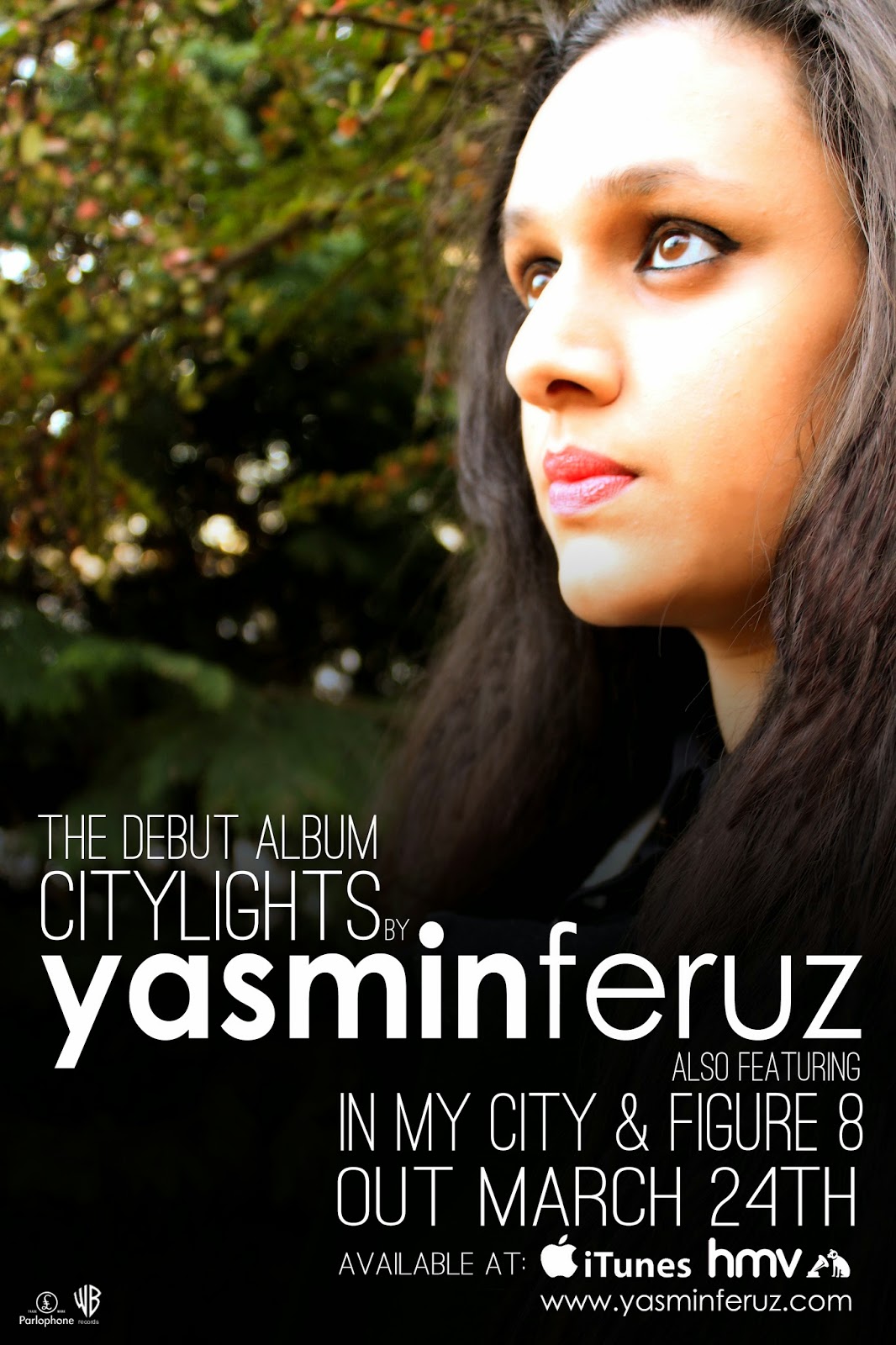
The advertisement was a simple process for me which wasn't that difficult. This is because after doing loads of research into adverts I discovered that most adverts are just another version of the album cover sometimes the actual album cover image is used as the poster image without the album name and name of artist in the layout of a album cover: instead the poster should have information more than just name and title. The advertisement poster I have done is not like that but does have the image of the album in the poster so that the audience will be able to know what to look for when they get into the stores to find it.
Sunday, 12 January 2014
Ancillary: The Advertisement Explained!
![]() |
| Advertisement |
![]() |
| Digipack front cover |
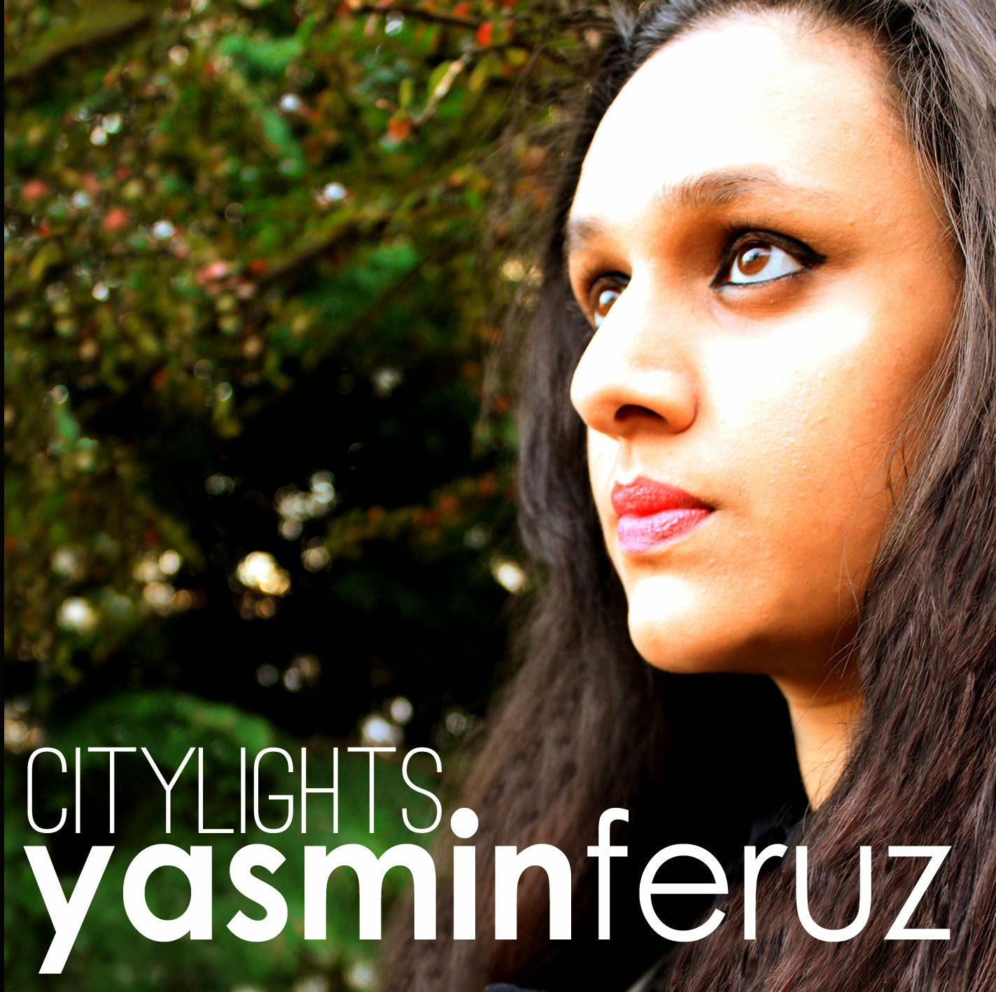
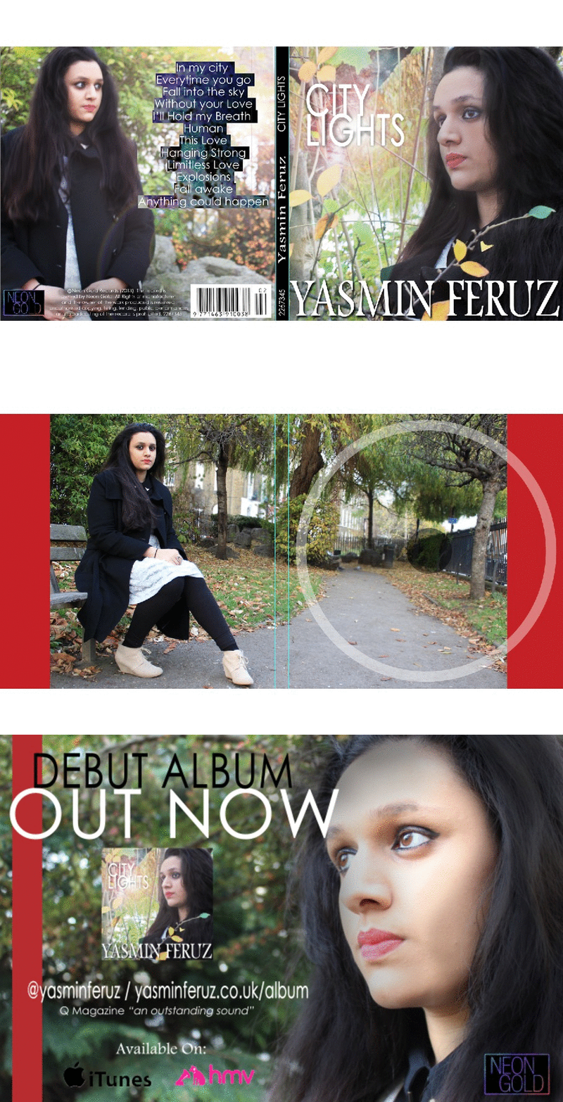
I purposely used the same image from the digipack as the background for the advertisement so I wouldn't have to put an image of the digipack in the advertisement which would have potentially ruined the sophisticated atmosphere of the advert. Also, the placement of the text along with the colors is somewhat identical to my digipack as the album name "Citylights" is directly placed above the artist name "Yasmin Feruz", along with the same color text. Right, let's go back to my advertisement, and maybe the weaknesses? A weakness in my advert could potentially be the lack of ratings that increase credibility, or social networking that increase fan interaction between the artist. The reason I didn't want to add these things is mainly because they could ruin the whole compact layout and simplistic feel of the advert due to the disruption in continuity and flow, which is something I value and mention a few times in previous blog posts.
![]() |
| Jessie J Advertisement |
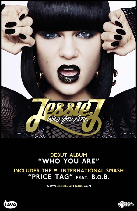
So here's some examples that disregard both, the first advertisement I came across that lacked both of these aspects was from "Jessie J" and her album "Who You Are". The advert is weirdly similar to mine in the sense of colors and simplicity. The use of black and white highlights the simplistic approach yet the use of gold has begun to take over to become a more stylistic advert. The advert itself is missing both social networking sites and ratings, which does give me some fuel to reason my own reasoning of not including them, if she can do it, why can't I? Here's why, Jessie J happens to one of the biggest pop stars on the planet, so I doubt she will need the opinion of someone who sits in their office writing reviews all day on people they've never met. Nevertheless the rating does help improve the credibility and draw attention to new artist's but for someone like Jesse J who has accumulated a huge following online and offline, wouldn't need the extra exposure I guess. Also the absence of the social networking sites is replaced with the artist's website which could be a better place for fan interaction as well as providing more information regarding the artist, something which I have done, replacing social networking sites with a website.
![]() |
| Gabrielle Aplin Advertisement |
![]() |
| Gabrielle Aplin's Album Cover |
Does that make me justified? Hopefully my reasoning are justified and do not backfire as they do contain some relevance as to why I didn't include ratings or any social networking sites in my advert.
Friday, 10 January 2014
Ancillary: Le Advertisement Process...
![]() |
| First Attempt |
Creating an advertisement was extremely challenging mainly because I didn't know how to to apparoah it but as I created my digipack first, it begun to set the foundations to my advert in terms of colours, text and images. As I opened up a new document for my advert, I wasn't sure whether to do go with a landscape or portrait layout, although my mock-up had a portrait layout, I thought it would be best to go for a landscape layout in which turned out to be the worst choice I made, and instantly went back to my initial idea from my mock up. This happened several times (3 times to be precise), that I went back and forth between both landscape and portrait layouts. The first attempt at the advertisement was in my eyes, horrendous, although I didn't get far enough, the advert didn't really feel unique when in comparison to all the student advertisements I have seen. Probably from the landscape layout is what made is look so "generic" and probably the black box which fades in (WHOOPDEDOO). ![]() |
| Citylights fits right above Yasmin Feruz |
![]() |
| Second Attempt |
I started again, but still kept the landscape layout but did play around with the colours and the wording of the advert. I felt this advert has a more unique feel to it, maybe because it differed a lot from the digipack itself as I used black font instead of white but had a white background to maintain the colors scheme, I only changed the font colour. I also added a black bar along the side of the advert because I thought it added a stylistic element to the whole digipack, which did look pretty good to me. The whole wording of the advert did take a bit of testing as I couldn't find something that felt right and looked good. With this advert, I didn't really sense a sense of synergy with the digipack mainly because of the colour of the text, but also the layout I used. It felt to centered whilst the white background didn't flow into the image where the front cover of my digipack felt like everything fitted together in terms of the colour scheme, the image and text in which I had to incorporate into the advert. So I started again but this time taking everything I wrote into the next attempt because I was too lazy to rewrite the whole thing.
This was my final attempt, where I kind of followed my mock up cause I decided to move on to a portrait layout, which turned out the work a lot better than the landscape layout. As I was making this advert, I continued to experiment with colours, the text, and the background. I went back to the white text and black background from the first attempt as the overall flow felt a lot more better. With this advert, I tried making the placement of the text a lot more unique so I began to make all the information such as the release date, website and everything else a lot more central to the artists name to draw more attention to her as the whole point of the advert is primarily to sell the artist and secondly the album. I maintained the white throughout as I did in my digipack, whilst it didn't feel right to throw in another colour that could potentially ruin the simplicity of both products. The gradient which I used worked exceptionally good as the image blended well in the the black gradient due to the dark colours of the image. Thursday, 9 January 2014
Ancillary: Digipack & Advertisement Draft.
These are the close to final outcomes of my digipack and advertisement, however there are some things that I need to include and possibly change, for example the inside cover, which I want to tone down a bit as the leaves may be a tad over the top. Overall, I am happy with how my advertisment and the front cover of my digipack turned out.
Ancillary: Past Student Ancillary Analysis
I behold the most aggravating, annoying, frustrating software ever created. Enjoy.
EVALUATION - Question 2 ideas
Since I am nearly finished my ancillary work I have decided to start planning Question 2.
HOW EFFECTIVE IS THE COMBINATION OF YOUR MAIN PRODUCT (VIDEO) AND ANCILLARY TEXT (DIGIPAK AND ADVERTISEMENT)?
I will write about how my music video and ancillary products link with each other. I was planning to use prezi for this evaluation question as there is quiet a lot to cover. Additionally I am also hoping to use an annotation app to show how my products all interlink.
Things I will cover:
I will write about how my music video and ancillary products link with each other. I was planning to use prezi for this evaluation question as there is quiet a lot to cover. Additionally I am also hoping to use an annotation app to show how my products all interlink.
Things I will cover:
- Synergy ideas (Scarf to red lipstick)
- Where the synergy is used
- Main colours
- Fonts
Things I am considering to talk about:
- Influential video's
- Influential albums/digipaks
PLANNING - Digipack
So from some feedback I noticed that I forgot to show how I planned my digipack; the colours, fonts, costumes and locations.
COLOURS:The colours which I wanted to use were the same colours used in the music video - white, black and red. I feel that these colours do compliment each other and therefore would stand out more. I feel that because they are contrasting colours they would stand out - the red/pink font of the artist name would stand out and this is good because this artist is new to the industry. Below is an album which influenced my choice of colour.
This Rebecca Ferguson album is very outstanding. I feel that this artist is the centre of attention even though it is not a close up but rather a long shot. Her costume is red which makes her look attractive for her audience but she is covered up at the same time which could mean that she does not intend to attract the male gaze and females could be her main audience. The white font in the middle of the album is quite sophisticated and simple at the same time. I like the fact that the colour of the font is white since the background is quite dark and therefore it looks good on the page.
FINAL COLOURS: BLACK - WHITE - RED
FONTS:
I decided to use two separate fonts - I wanted to use the same font which was used in the beginning of the music video so that there is a clear elation between the music video and the digipack. The whole idea that I wanted the font to be quite big and bright was from Robin Thick's music VIDEO blurred lines.
Although I am not using this font - I am using the colours which he used and having the idea of the big fonts. The font of the artist name was called 'Century Gothic' - I feel that it is not too formal or too informal.
For the font of 'city lights' and the rest of the fonts I used again a quiet simple text because I wanted the digipack to look sophisticated rather than full on girly. I used the font 'Tw Cen MT'.
COSTUME:
LOCATION:
FEEDBACK
Feedback from Mary
After an overview presentation of my ancillary pack, Mary has reminded me of some small mistakes that were edited later today.
The first thing was to do with the record label so thats been changed to Neon Gold. Due to the fact that
![]() |
| Record lebel company logo |
the record label was originally for rock bands. Neon Gold is known for their pop artists who have been signed up.
Also I almost forgot to change the copyright information because before it said that it was owned by Island Records and now its changed to Neon Gold. so thats another change made to the front of the album cover. Shown Below
![]() |
| Copyright information edited. Change of company who own the album. |
![]() |
| Added logo on the poster |
Also I forgot to add the record company logo in for the advertisement poster for the release of the album. The logo was added to the poster and one thing that I like about the Logo is that it goes well with the album cover and the poster.
One other mistake was the thought of the composition of the availability of album logos which needed to be more spaced out on the poster. Simple stuff really.
![]() |
| Spacing out of the logo's on the poster |
I almost also forgot to add the main feature of the poster. Which is to make it clear to the audience what to look for when you go to the store to buy the album or if you opt to buy it from iTunes. In all advertisement you must include the image of the product and I almost forgot that yet there was loads of space on the poster so I eventually worked out what was missing and that was the cover of the album shown in the poster to make it look nice and appealing but most importantly less confusing.
![]() |
| Actual screen grabbed image from the poster. |
DONE ?
I have finished the:
_ (Front) Album Cover
_ (Inside) Album Cover
_ Advertisement for the album release
I have included a label cover with background research.
Included the red strip to represent the scarf in the music video.
Made sure that all photos look similar and the red lipstick is visible.
I've included the Barcode, Record Label, Title on spine and Copyright information.
_ (Front) Album Cover
_ (Inside) Album Cover
_ Advertisement for the album release
I have included a label cover with background research.
Included the red strip to represent the scarf in the music video.
Made sure that all photos look similar and the red lipstick is visible.
I've included the Barcode, Record Label, Title on spine and Copyright information.
Now for Feedback from Rebecca & Mary before posting the final images.
Ancillary: Text and Colours
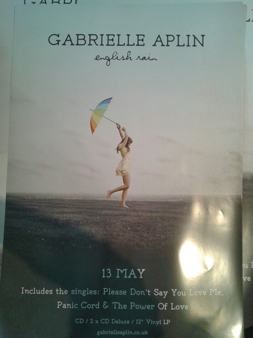
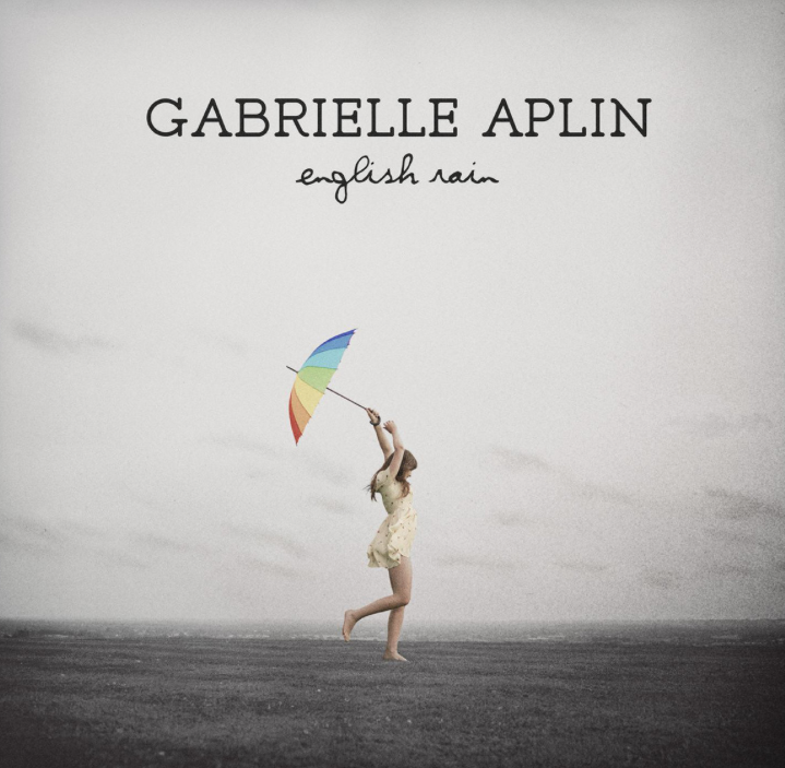
When I first started my digipack, I wasn't sure whether to use one font to have a sense of simplicity or have two fonts for some variation within the whole digipack. After my initial research and going back to my inspirations, I looked at the variation in texts that the digipacks used, and the one that stood out to me the most was from Gabrielle Aplin, who uses two fonts that work really well together. The artists name really stands out from the whole front cover as it is clearly the most dominant aspect as opposed to the album name which is clearly smaller yet holds it's own significance due to the difference in font. The calligraphic type of text really captures the femininity of the artists, and it the same colour of the artist name which highlights their link to each other. The font type was carried in the back cover of the digipack where the colours of the text was also the same. Another thing that I really admired about the digipack is the placement of the text itself, especially for the back cover where everything from the track-list to the barcode was centred. The use of colours in this digipack is exceptionally well in my eyes as it contain a sense of simplicity and doesn't overdo it, the use of black font for the track lists and the white for the labels, barcode and copyright information set them apart from each other, which goes to show that the smaller things in life have a bigger impact.
![]() |
| The Outcome |
![]() |
| Century Gothic, Ostrich and Popsies |
Once I had a look at the digipack above, I wanted to take a lot of aspects into my own digipack as I thought the taste and simplicity of the digipack was well executed and is something that I wanted to do myself. When I first started, my digipack only had one type of font that was used consistently throughout the whole digipack, but after researching I though it would be best to have another font so there is some variation, and more versatility for me to experiment. I kept the artists name in lowercase and the largest thing on the front cover as I thought it would make it unique and more noticeable to the other things on the cover. The font I used at first was "Century Gothic", and at the time it looked good but went on to look bland and repetitive so I chose another font which is similar to Gabrielle Aplins and thought it worked well, and the font was "Popsies". However, I also saw another font that caught my eye, and this font was "Ostrich" which worked really well with the artist names which is uniquely "Century Gothic". This essentially became a problem as I wasn't sure whether to use "Popsies" or "Ostrich", so I decided to ask which one people preferred and most said they preferred the "Ostrich" font.
![]() |
| Back-cover w/ centred text and info. |
Once I worked out the fonts I wanted to use, the "Century Gothic" for the artist name and "Ostrich" for the album name, I thought it would be best to have the colours of the text the same throughout and I decided to go for white as I thought it would stand it stand out from the background its placed on. The colour white was also taken into the information that is found at the bottom of the back cover and essentially became a sort of motif that is apparent in all my ancillary products. Just like Gabrielle Aplin, I took the idea of having everything of the back cover centred and it worked just as well as I thought it would. By doing this and maintaining the colour white, the whole digipack had a good sense of continuity and flow. For the spine of the digipack, I made the background black so I could still use the white text, and it worked well as it set a distinction between both the front and back cover, yet it still maintained the flow through the continuous white text.
![]() |
| Layout for the advert text |
After I finished the front and back cover of my digipack, I moved onto my advertisement, which has similar aspects to the text and colours of my digipack. The advert itself has a similar colours scheme of the black and white, with the black coming from the gradient in which is placed at the bottom of the advert and the text is white, placed above the black gradient. I used the same combination of font which is the "Century Gothic" and "Ostrich", adding some synergy to the digipack and advert. Like my digipack, I kept the artists name in "Century Gothic" with everything else in "Ostrich". After doing some initial research, I wasn't sure how to approach the layout, but once I tried various ideas, I decided to make everything a lot more compact and centred around the the artist name, so there is more significance on selling the artist. I think this advert was the best one out of all the adverts I attempted at making, with most being discarded or me just giving up, but let's save that for another blog.
RECORD LABEL CHOICE
At first I chose to have the Island Records however after a little research I found out that the Record has more been involved in Rock Music as its origin. So therefore I had to change this due to the fact that it wont be practical to use it as a record label for my album cover and artist. Where our genre is Indie Pop not Rock.
By doing some research on our original artist of the song - in my city I discovered a record label called: NEON GOLD.
So now the new logo is NEON GOLD. which are also signed under Marina and the diamonds and Ellie Goulding but along side other record labels too.
Subscribe to:
Posts (Atom)